Users across the globe access websites from all sorts of different screen sizes. From small mobile phone screens of around 320px width to big 5k resolution screens. That makes it difficult for web designers to choose the right resolutions for their designing website UIs.
When designing websites in your favorite design tool like XD, Sketch or Figma, how do you choose the right artboard and container widths for different screen sizes? How to make the most optimum use of your time and create only that set of screen variations that would take care of most desktop, tablet and mobile screen sizes?
At Fantastech, we work primarily on design to HTML and WordPress conversion projects, so we get designs from our clients at all sorts of artboard and container sizes for different devices.
The most popular artboard width choice among them is 1920px for desktop designs, 768px for tablets and 375px for mobiles. Some even go to the extent to create more variations at 1024px, 1366px, 1440px etc to cover more screen sizes. With container widths, it’s all over the place, some prefer to do it 1170px, some 1200px, some do it at 1440px.
But are these the right sizes to choose? And how many variations should you create anyways? Let’s have a look…
Let’s First Define Artboards and Containers
When you’re designing website UIs using one of the UI/UX design tools like Adobe XD, Fimga, Sketch etc, you have to start with a blank white canvas or artboard where you do your designs. It’s called an Artboard in Adobe XD, Sketch & Photoshop and Frame in Figma. So when starting to design, that’s the first thing you need to create.
Now within that artboard, there’s a middle content part in websites that come within a fixed container. For most sites the different sections on a page may touch edges of the artboards like in case of full width background and sliders, but content usually stays with a particular container. That’s what we call as a Container.
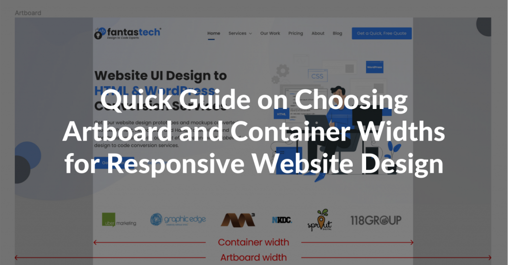
To illustrate this, have a look at the our website’s homepage design below:
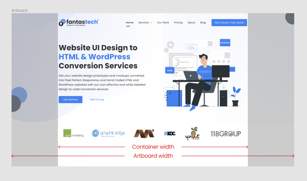
Here’ you’ll notice that the container is of lesser width compared to the artboard and we have some space on both sides of the container.
If you open our homepage on a desktop screen and zoom in and out, or open it on different desktop screens, you’ll notice that the container always remains the same width but the blank space around it changes with the different screen sizes.
So for designing websites, if we keep can find that ideal container width that would work across all popular screen sizes with still some space left on either sides of the screen, we’d have found that perfect container width that would be compatible with most desktop screen sizes across the globe.
Let’s look at what that container width should be and then we’ll look into what artboard size you should use.
Artboard and Container Widths for Large Screens (Desktops and Laptops)
To find our the most optimum artboard and container widths, we need to first know the screen resolutions that are most popular across the globe. According to StatCounter.com, here’s what we know about the desktop screen market (as of March, 2021):
| Screen Size | Global Usage | North America | Europe | Asia | Oceania |
| 1920×1080 | 21.7% | 20.79% | 25.9% | 20.02% | 23.93% |
|---|---|---|---|---|---|
| 1366×768 | 20.95% | 16.19% | 16.13% | 26.4% | 13.67% |
| 1536×864 | 9.65% | 7.67% | 11.42% | 10.53% | 7.41% |
| 1440×900 | 6.65% | 8.72% | 6.79% | 4.83% | 11.8% |
| 1280×720 | 5.4% | 4.64% | 5.06% | 6.63% | 6.93% |
| 1600×900 | 3.72% | 3.76% | 3.91% | 3.42% | – |
Let’s Start With Finding The Optimum Container Width for Large Screens
From the table above, we can see that all the popular screen sizes in the market are at 1280px width or above that. That means if we can keep our content container size below that, we’ll be able to cover all major desktop and laptop screens in the market available right now globally.
That gives us an ideal container width of around 1200px width. At 1200px width, even on the lowest screen size of 1280px we still have white space of 40px left on both sides, so that works really well for desktops and laptops and that’s we also recommend to our clients. You can either use 1200px or anything below that and that should fine across all large screens.
And you don’t need to take my word for it. Have a look at what the following popular brands are using:
- Microsoft suggests 1008px and higher as desktop container width.
- Twitter’s Bootstrap, which is the most popular CSS framework in the market, has been using default container size of 1170px till version 4.
- Foundation CSS framework, which is the 2nd most popular CSS framework, uses 1200px as it’s default max container width for rows.
- Semantic UI framework, which is again a very popular CSS framework, uses 1127px as it’s default max container width for rows.
- Popular page builders like Beaver Builder uses 1100px, Elementor uses 1140px and Divi builder uses 1180px as their default container widths.
- Talking about popular WordPress themes, Divi theme uses 1080px, Astra, OceanWP and Avada use 1200px and Genesis uses 1040px as their default container widths.
- Kinsta and WPEngine, providers of premium WordPress hosting services, use a max container width of 1200px.
- Even WordPress’s official website uses container width of 960px!
From all these examples you can see that all of them use container widths of either 1200px or lower for desktops and laptop screens. So with that said, you can easily conclude that going with the 1200px container width would be the right choice for your next website design project that would work well on all major screens in the market.
Most Optimum Artboard Width for Large Screens
With container width out of the way, choosing the artboard width becomes very easy. You can keep the artboard size pretty much anything that you want as long as it’s wider than the container width and you have some space left on either sides of the container.
You can use any width among the popular screen resolutions: 1280px, 1366px, 1440px, 1536px, 1600px or 1920px. At our agency, we recommend our clients to use artboard width of 1440px. But it does not really matter what you use, as long as your container fits in well within the artboard with some space left on both sides.
Artboard and Container Widths for Smaller Screens: Tablets & Mobiles
For tablets and mobile devices, it is easier to choose artboard and container widths as you have only a limited number of popular screen sizes globally. In most cases the artboard width you’ll be using would be same as the width of the device that your users usually use.
Regarding container width, sites on tablets and mobiles are usually designed to stretch and touch both ends of the screen. So if we keep a padding of 15px or 20px on either sides within the artboard, you will have your container ready!
Let’s look at what artboard size you should keep for tablet design. Here are the most popular tablet screen resolutions globally (as of March, 2021) according to StatsCounter.com:
| Screen Size | Global Usage |
| 768×1024 | 43.59% |
|---|---|
| 1280×800 | 7.22% |
| 800×1280 | 5.67% |
| 601×962 | 4.98% |
| 810×1080 | 3.65% |
| 962×601 | 3.57% |
From these stats it’s pretty clear that 768px width screens are the most popular ones. So you can keep the artboard width for your tablet designs at 768px and you’ll be good to go. So for tablets, we recommend you to keep 768px as artboard width and for container width, just add some padding of 20px on each side to make it 728px.
For mobile phones, here are the most popular mobile screen resolutions globally (as of March, 2021) according to StatsCounter:
| Screen Size | Global Usage |
| 360×640 | 11.26% |
|---|---|
| 414×896 | 7.84% |
| 375×667 | 6.02% |
| 360×780 | 5.94% |
| 360×760 | 5.13% |
| 375×812 | 5.02% |
Looking at these stats, we notice that there are only 3 screen widths that are most popular: 360px, 375px and 414px. There’s no big difference among these sizes and no matter which size you choose among these the designs would look almost identical in each of them.
We would recommend you to use 360px as artboard size for your mobile designs because that’s the most popular width compared to others. But even if you choose any of the other two widths, that should still be ok.
Regarding container size, like tablet screens you can keep padding on both sides at around 20px to make the container width 320px and that should work well for most mobile devices.
Conclusion
I tried to keep this article short and to the point. By looking at the most popular screen sizes for desktop, tablets and mobile devices globally, we can figure out the artboard and container widths to use for designing website UIs.
I recommend designing only 3 variations, one each for desktop, tablet and mobile screens at the following artboard and container widths:
| Device | Artboard Width | Content Container Width |
| Large Screens (Desktops and Laptops) | 1440px | 1200px |
| Tablets | 768px | 728px |
| Mobiles | 360px | 320px |
Designing only 3 variations and at these widths would be the most efficient use of your time and would cover every major screen size present in the market.
I hope you found this article useful. What do you think? Do you agree or disagree to these widths? If you have any comments or suggestions, feel free to leave a comment in the comment box below.

Absolutely awesome article, to be honest I liked this article and I am definitely pinning it for share.