WordPress powers over 37% of the Internet as of writing this. For reasons known and unknown, it is the behemoth that delivers a great publishing and website platform for every brand big or small.
From governments to corporations, WordPress has proven itself to be the perfect choice for creating a website of business of all sizes.
Here in this post, let’s take a look at 50 brands who have built their websites on WordPress. And in case these were sufficient to impress you on using WordPress for you website project, head over to our homepage to learn about our WordPress development services and if you we seem right match for your requirements, feel free to get in touch. 🙂
1. Chicago Sun Times
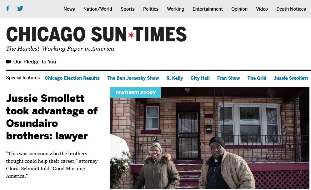
Chicago Sun Times, the well known news portal serves millions of customers every day. Its distinctive features include minimalist and old school design, grid layout, white-gray-black tones and multiple widgets for enhanced functionality.
2. AMC
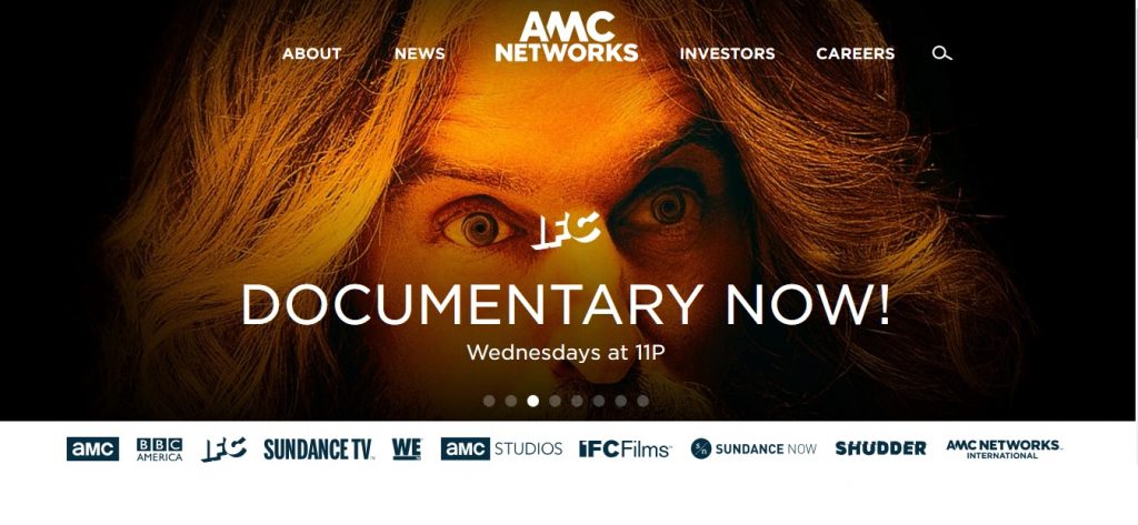
AMC uses WP in its own unique way. It employs full width features images, scroll friendly navigation, colorful and distinctive content sections and is fairly rich in multimedia content spread all throughout the pages uniformly.
3. BBC America

BBC America employs large features images with a blog-like boxed layout that modern blogs are popular for. Dark skin homepage adds to the unique look along with modern and minimalist design theme.
4. Mercedes-Benz
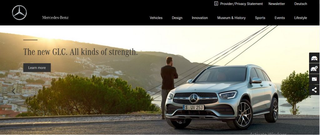
Mercedes Benz rightfully employs WordPress to depict that legacy of automotive finesse that WP reflects in IT realm. The simple grid layout along with dark design accentuates the current layout of its cars as well. Boxed structure makes it easy to consume content. The carousels are used nicely to match with the overall theme.
5. Groupe Renault
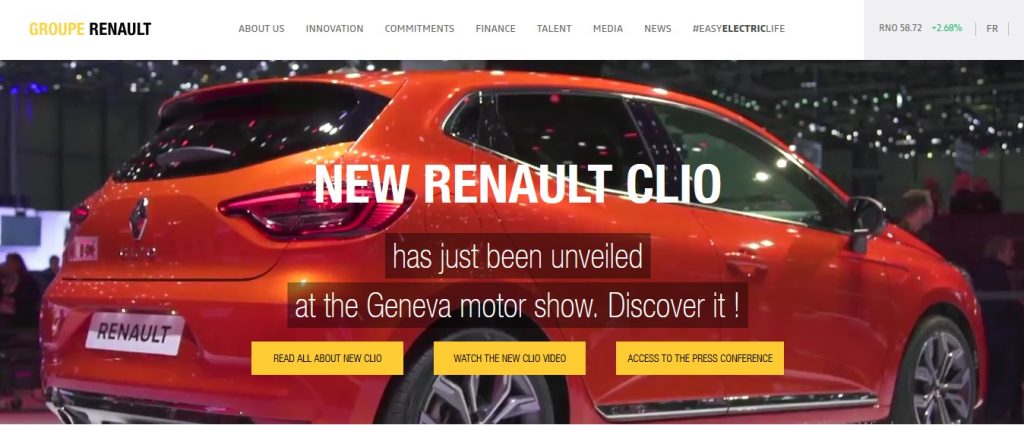
Groupe Renault, another automotive giant, employs WP features like full-width video header, unique social media integration, clean blog-like design and well-designed colorful categories box with great icons. The distinguishing feature is the homepage that seems like a perfect landing page serving two purposes at once.
6. Wired
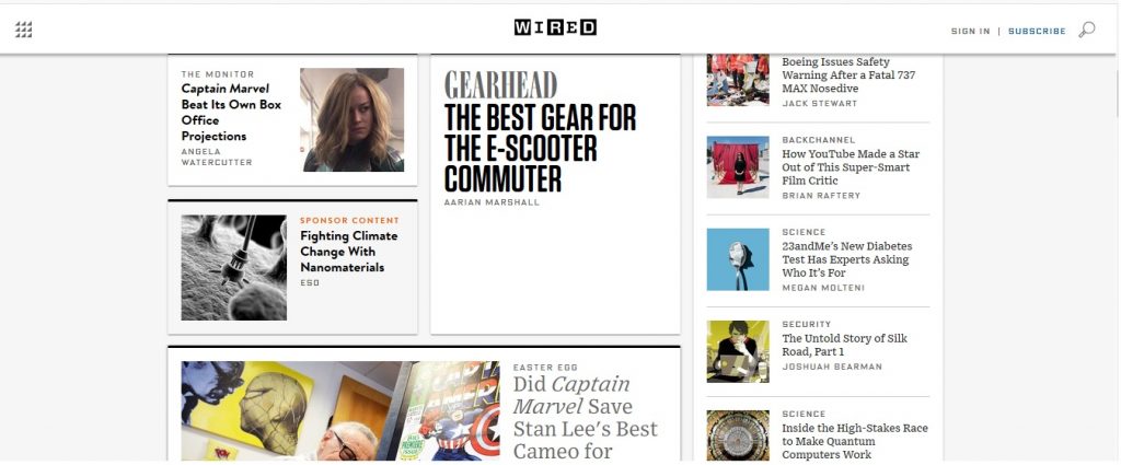
Wired, a tech website, is highly popular serving millions of visitors every day. The black and white design is very elegant. Magazine like appearance makes content digestion very easy along with beautiful typography. Animated and creative content blocks are displayed in various sizes/forms to create a holistic look. Parallax also flows smoothly while scrolling.
7. Time
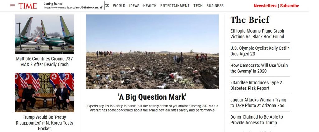
Time, another timeless brand, uses WordPress to represent its core media house values through an elegant website. The magazine homepage style along with clean, classic news site design adds to the character of the brand. Typography, a distinguishing feature of news websites, is accomplished very well here. Slideshow of influential images is another great way to disburse content to the users.
8. The Rolling Stones
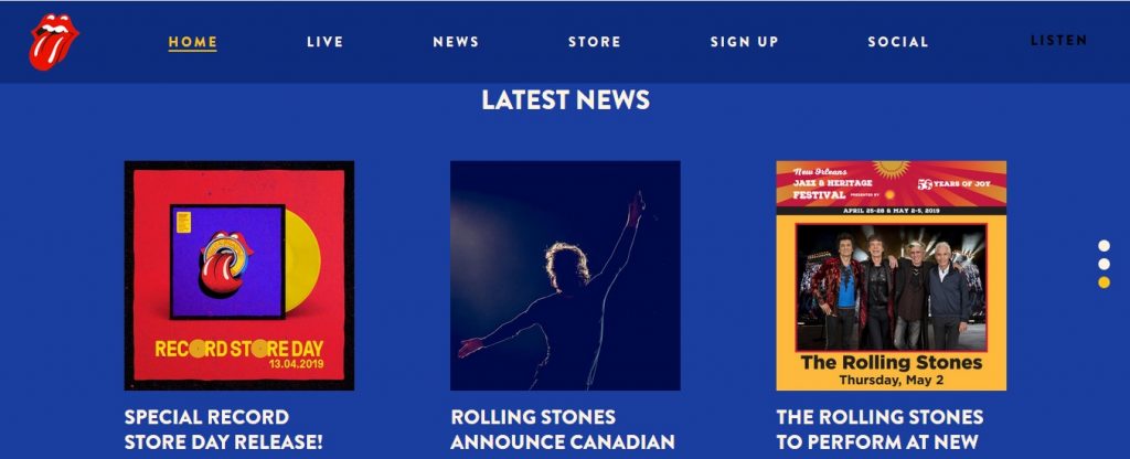
Rolling Stones, the iconic music brand, uses WP to create a colorful yet simple website. Its rock legacy is apparent in the typography and fonts. There are lots of video posts to the group’s historic performances and other useful links. The interface is intuitive and playful with rich multimedia content including audio, images and videos. There’s a landing page for the app as well.
9. Beyonce

The lady with the melodious voice trusts WordPress to represent her digital presence. The full screen homepage layout creates a wholesome impression on the first time visitor. Modern back and white tones along with clean, grid-like layout looks awesome. Plenty of large visuals with galleries and ribbons helps create a unique navigation experience.
10. University of Washington

An eminent educational institute uses WordPress in its own historic iteration. Modern design, big animated visuals in pages and colorful elements all bring a sense of finesse to the design. Full screen parallax works smoothly without any hiccups and supporting images deliver the message right. Simple and minimalist homepage further accentuates the overall design language.
11. TED Blog
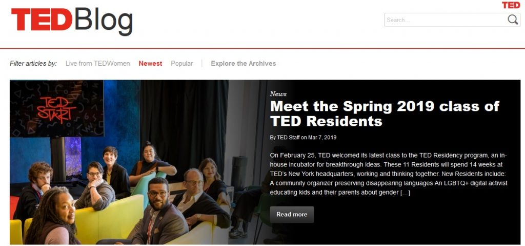
Nothing speaks knowledge like Ted Blogs. What started as simple lectures turned into humanity’s finest knowledge warehouse. And to match its reputation, WP delivers an equally impressive website with simple blog page layout. Content is neatly organized in clean blocks with simple sidebar providing space for vital widgets.
12. The Official James Bond 007 Website
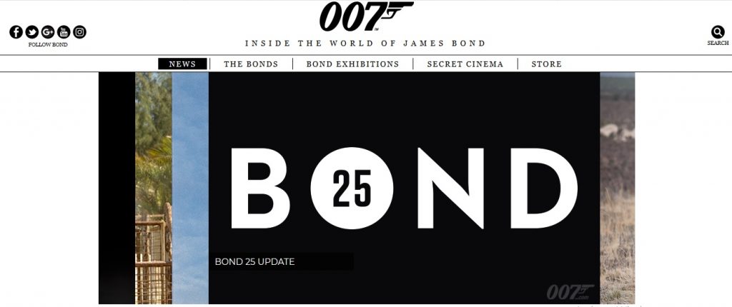
James Bond’s official website too has a license to kill (with its looks of course). The clean and classy design reflects the British understated design theme. Retina display and modern typography ensures the website stands out. Grid animated posts along with overlaid animated content blocks leaves a lasting impression.
13. Usain Bolt
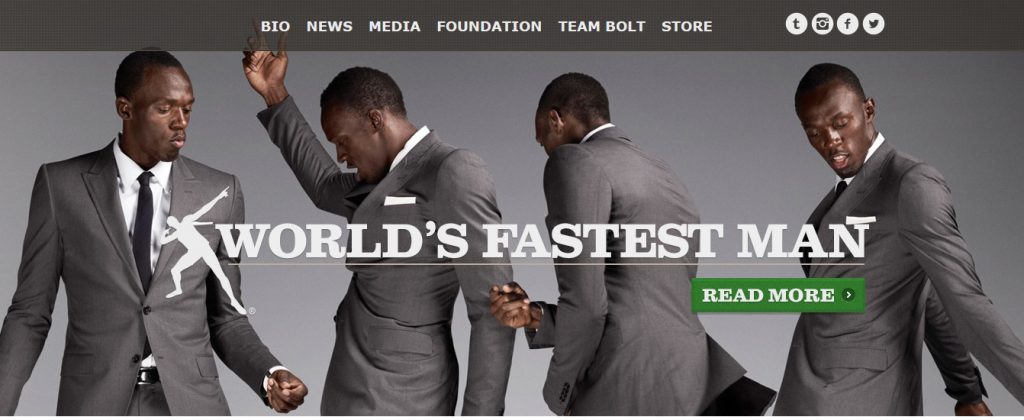
Usain Bolt is the one celebrity who’s perfect match for WordPress’s speed and endurance powers. The parallax full-width slider helps deliver crisp images to the visitor. Grid structure with minimalist pages creates the perfect sport star aura. There’s a well supported modern online shop. The slider in the homepage and animated grid for galleries and news is a perfect finishing touch.
14. The Walt Disney Company
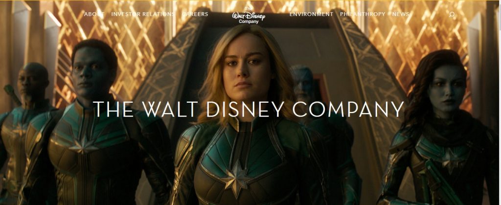
This iconic Hollywood brand puts its money on WordPress when it comes to making a digital footprint. The grid and large featured images with clean blogpage style is homely. The long about us page serves every piece of knowledge there is about Walt Disney. Colorful and modern animated buttons/fonts create a good look. Rainbow-like pastel tones further accentuate the happy youthful spirit of the brand.
15. Reuters Blogs
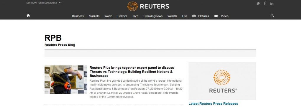
This fast flowing news portal can be best handled by WordPress. With grid-like homepage with minimalist and simple posts, this website is ideal design for a news website. The old school newspaper theme creates the classic look most news readers are used to. Most importantly, the design is content focused with a professional appearance.
16. Tech Crunch

This well known tech portal is perhaps as old as the WordPress itself. So, naturally, WP was the right choice. Simple interface with old school content first approach works best here. There’s a separate box for videos at the homepage bottom which is a unique thought. Photos have a timeline. The overall look is gray and green in shades.
17. IBM Jobs Blog
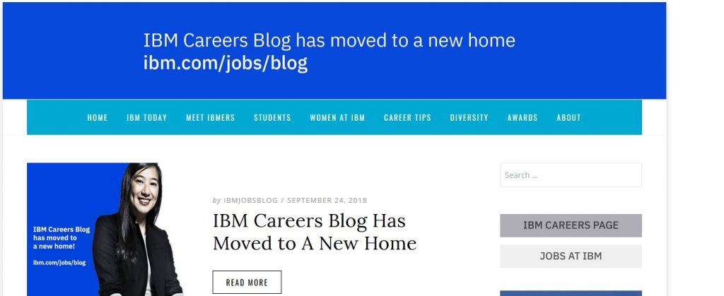
IBM, a reputed industrial setup, chooses modern retina display with clean design on its jobs blog page. As the name suggests, its blog-post like layout with infinite scroll. The carousel slider with featured posts is also a nice touch.
18. Vogue
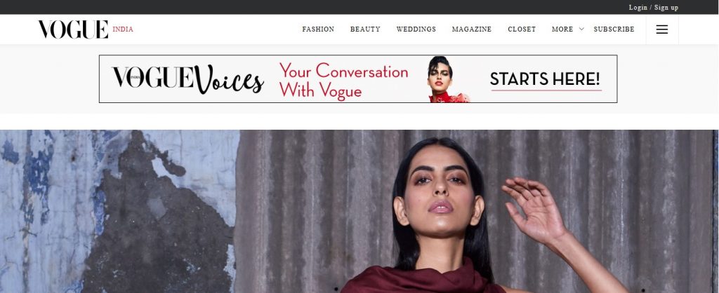
Vogue, is not just a fashion brand it’s a synonym of fashion word itself. Over the decades, it has delivered fashion statements to many generations. Naturally, its WordPress website carries simple design language with clean and modern design. Full width header, infinite scroll and multiple extended posts in blocks are some unique standout features.
19. Sony Music
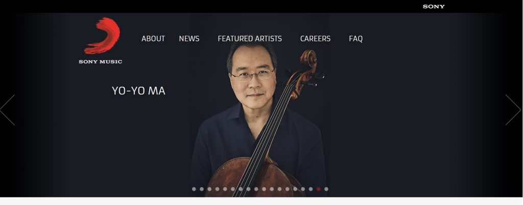
The historic brand carries its legacy onto the digital realm as well. The design is extremely minimalistic and clean. The 90’s fonts and visuals are laid out is grids. The artists pages is a history reminder of the brand’s iconic legacy. There’s prominent Twitter timeline.
20. New York Post
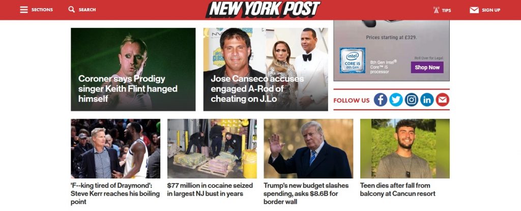
New York Post has carried America’s history on its shoulders for almost a century now. To represent this in a right manner on the web, NY Post chose WordPress. Alternating black and white sections create the perfect newspaper look. Beautifully delimited post categories is another nice touch. Well designed sidebars helps digest the content easily. Browsing is made easy with intuitively arranged articles for each category.
21. Angry Birds
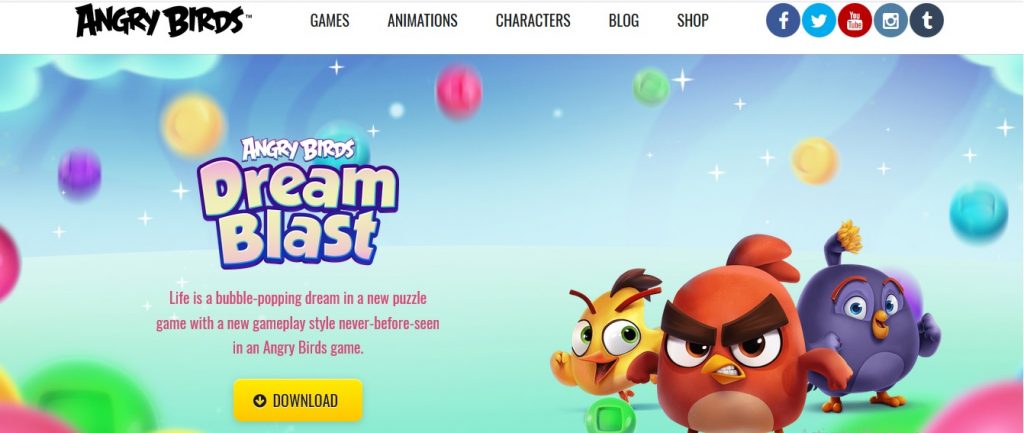
The worldwide gaming phenomenon creates a fine impression on its website too. The colorful full screen homepage gives an almost game like look. The custom top to bottom layout is well made. High quality media elements with scroll triggered animations and catchy effects adds to the overall gaming theme of the website.
22. Larry King Live
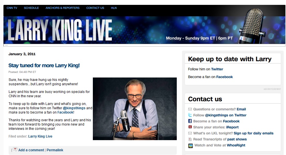
This legend of American news realm chose WP for his online presence. The old school and minimalist design creates a look suitable for him. There are not much media elements since it is mostly content oriented. Large sidebar ensures most of the information is readily available.
23. Harvard Gazette
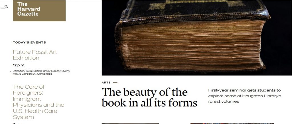
Another top educational institute goes the WP way. The modern clean look with professional icons creates the right look for an education portal. Friendly tabbed sidebar widget with multi-color menus and interesting tabbed category block for each items is perfect.
24. Fortune
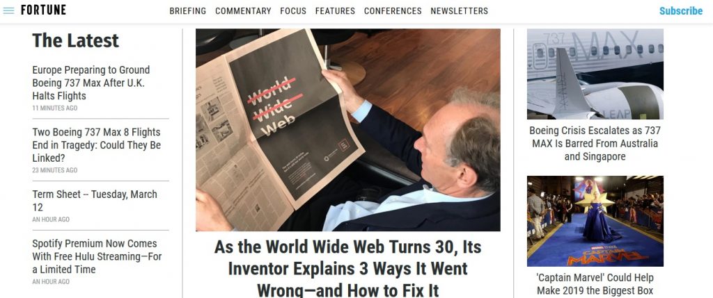
Fortune homepage has a landscape format making it look bigger. Four columns display content in a unique manner. The slideshow display for the featured section is great design element. Black and white professional look with an accent on video content looks great.
25. Justin Bieber
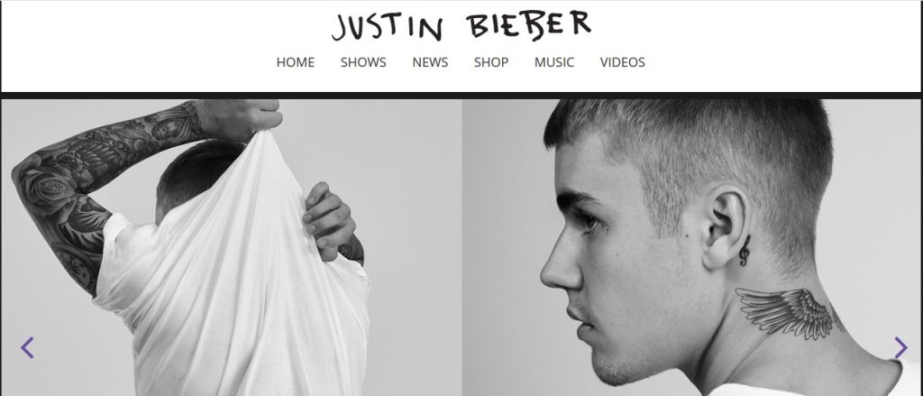
Justin Bieber, the worldwide acclaimed pop celebrity, has a awesome website to his name as well. The one-page boxed layout is clean. There are lots of animated carousels covering almost every section. Black and white are the dominant colors here.
26. Bloomberg Professional
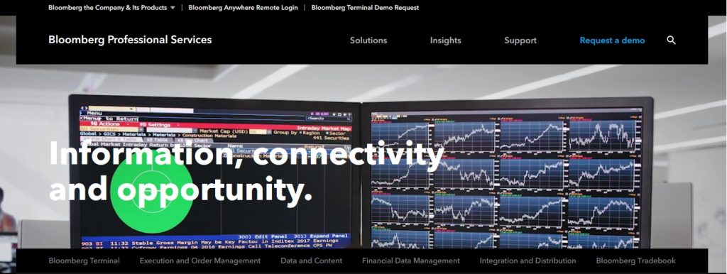
Bloomberg Professional is known around the world for best financial sector news, events and happening. It only makes sense that their website reflects the same. So, WP powers this top of the line setup with clean layouts, fast loading pages and extremely intuitive navigation.
27. Metro UK
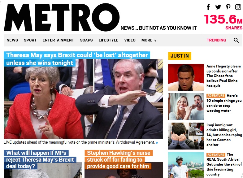
Metro UK is an entertainment and celebrity news magazine that also has a mobile ready WordPress site. Content is spread uniformly through a blocked layout making it easy to click on news and move through various articles. Images are of varied size to focus on the important news articles.
28. CNN Blogs
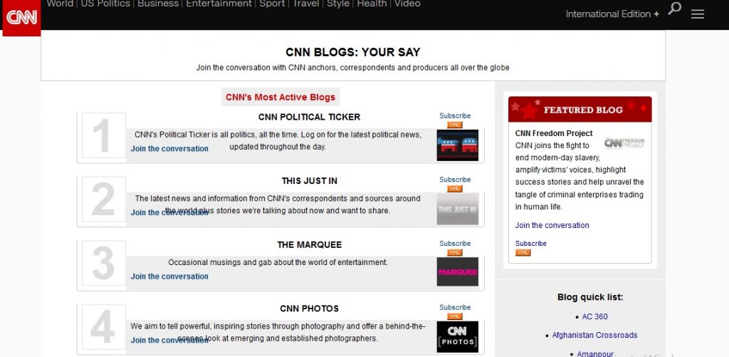
Just imagine the number of page views CNN serves every single day? If WordPress can serve that, it can surely handle a normal business website. CNN Blogs is truly scalable and delivers pages at lightening speeds showcasing the amazing scalable nature of WP.
29. CBS Local New York
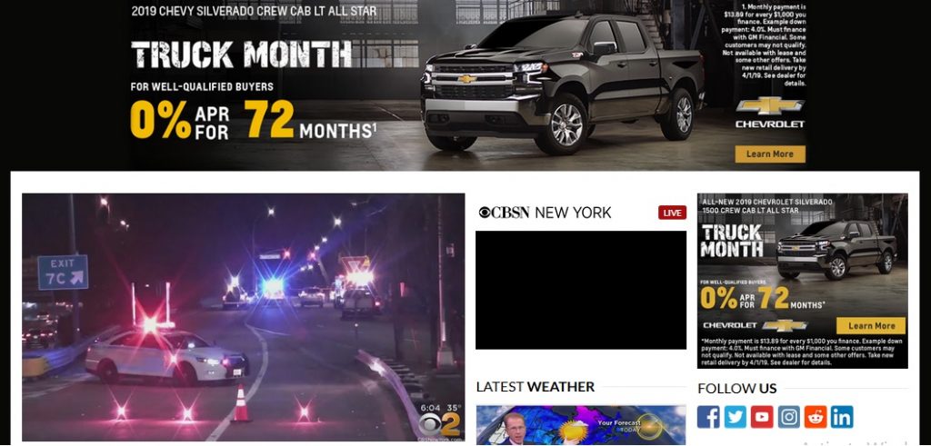
Another high performance news network employs WP to serve multiple pages simultaneously at lightening speeds. CBS Local New York has a grid layout with easy to read fonts and typography for that classic news reading.
30. Van Heusen
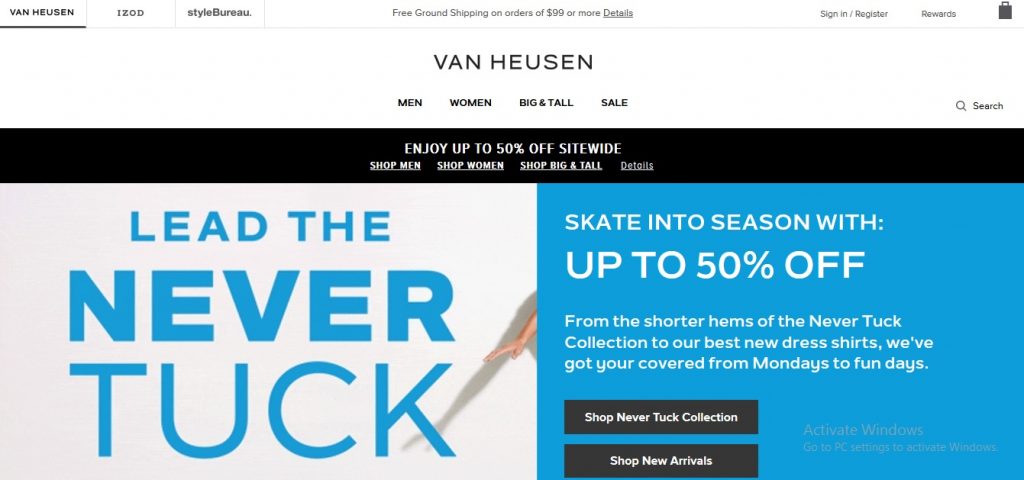
A top selling fashion brand, Van Heusen uses WordPress website that noy only looks great but performs the functions of ecommerce with aplomb.
31. Enterprise Magazine UK
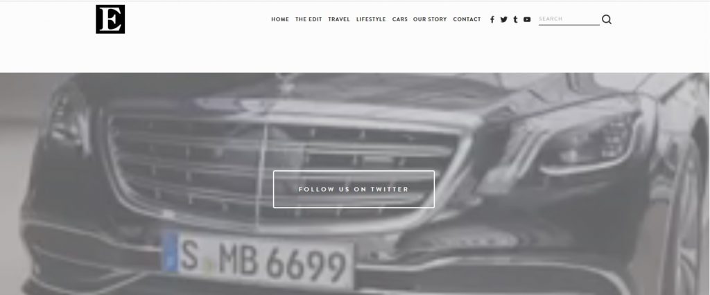
Enterprise Magazine UK provides highly useful information to its users about travel. WP allows them to customize each user’s browsing experience individually while also delivering a mobile friendly website.
32. WGN TV
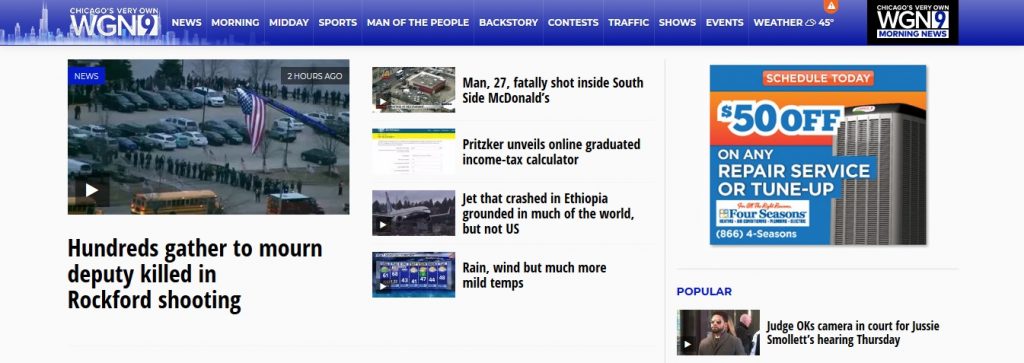
WGN TV is Chicago’s local news portal that offers up-to-the-minute local news. The blocked news articles ensures that more news is packed and is highly intuitive. Not only it excels in delivering news articles, it is easy to navigate and discover other useful functions. The easy-to-use interface is a cherry on the cake.
33. NASA
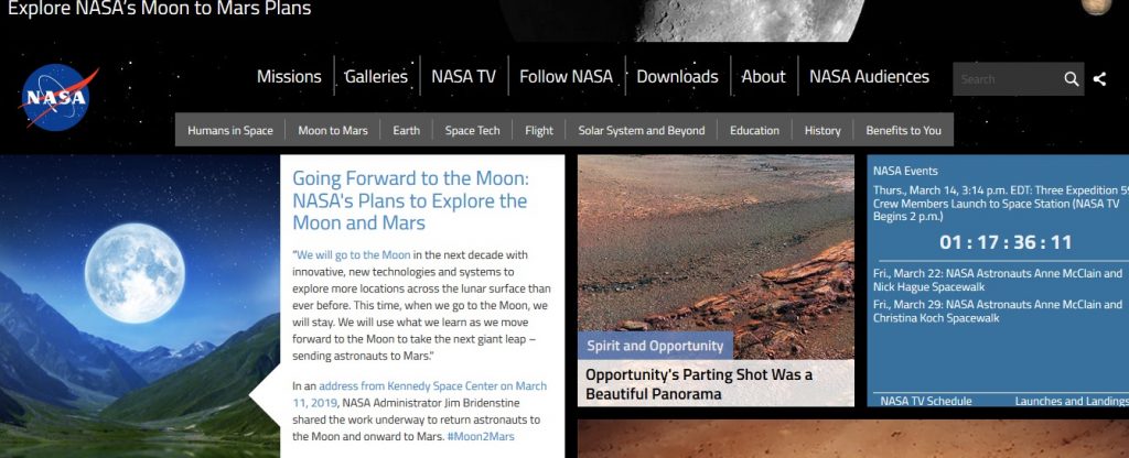
When NASA uses something, you have got to believe its credibility. NASA employing WP is an honor to WP’s capabilities and a belief in its power to create a truly world class website for stalwarts of technology.
34. People
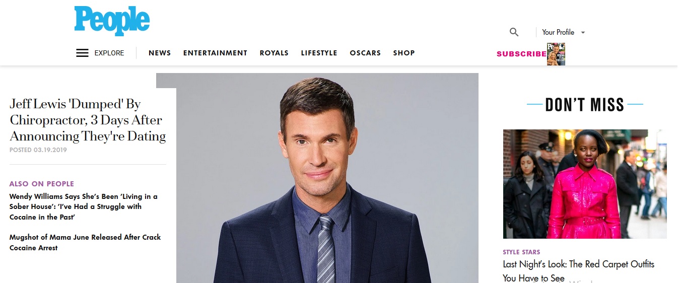
People website focuses on visually oriented design that is modern and conventional at the same time. Content rich homepage with right-left sidebars, clean interface with small connected elements and user-friendly design all come together in full harmony.
35. Herald Sun
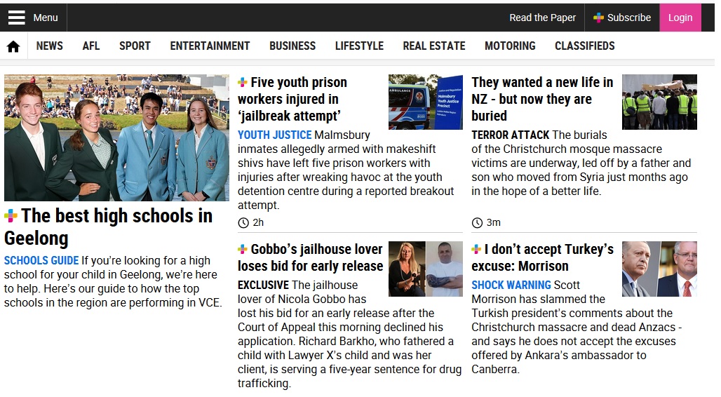
Just like other news websites, its distinctive features focus on boxed layout, huge content chunks, large animations, category-oriented distinctive colors and catchy effects. This all comes together to lay focus on news articles.
36. Facebook Newsroom
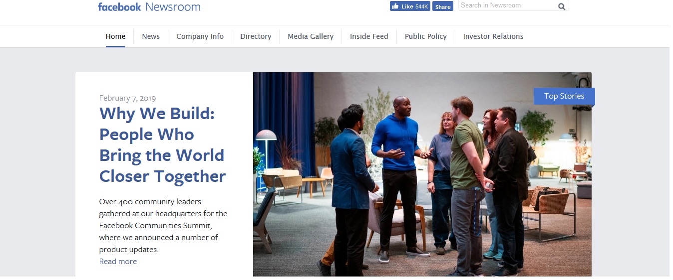
Minimalism is the key here. With two main content blocks, content is made king! Widgets are thrown in for functional richness along with media galleries and engaging timeline.
37. Microsoft Studios
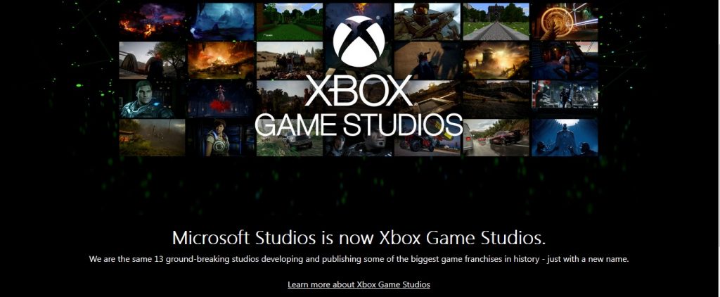
Microsoft Studios, the industry giants of video game production, has a futuristic website. In their quest to publish Xbox games and related information, they make sure their website is powered adequately. They just can’t afford downtime issues and WP ensures it delivers.
38. Portent

This tech website has a lot riding on it due to its highly sought after consultancy in PPC to SEO. No wonder they have chosen WP to handle their large traffic, improve revenue and also serve the customers perfectly. The layout is simple and clean with classic elements to help guide the visitors easily.
39. Pluto TV
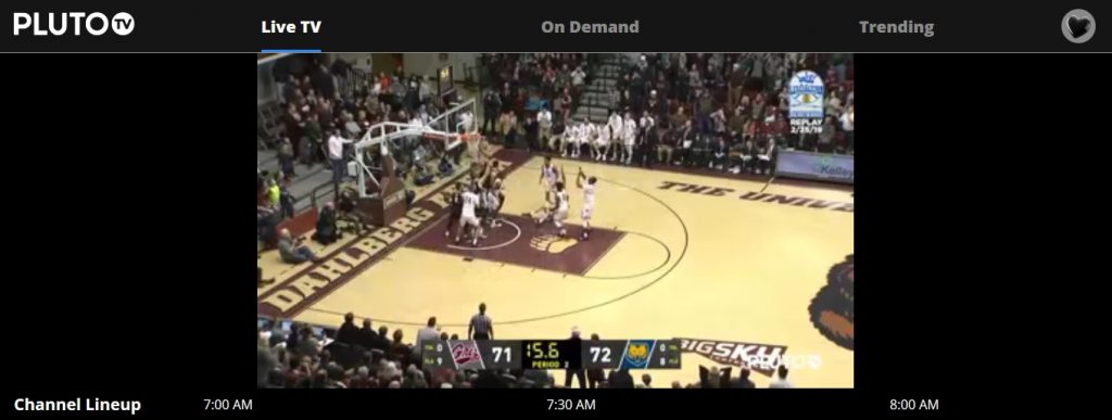
Pluto TV delivers free online television service broadcasting featuring more than 100 live channels. It consists of movies, internet videos and TV shows. So, WP delvers accessible content to millions of users with scalability being a huge factor.
40. Riverdance
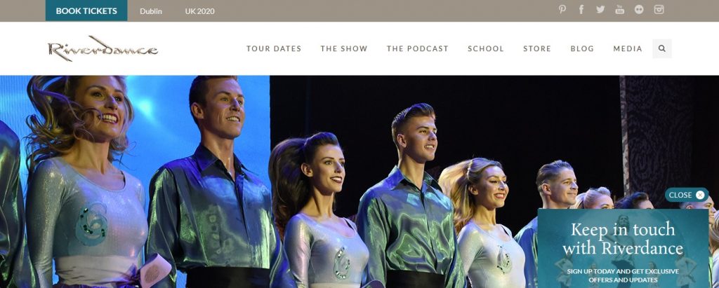
An international Irish dancing phenomenon, Riverdance serves more than 25 million people. The booking service alone is used by more than 5 million people world wide along with heavy video content hosting. The simple boxed layout with reasonable content blocks is liked by people from 6 continents.
41. Polk State College
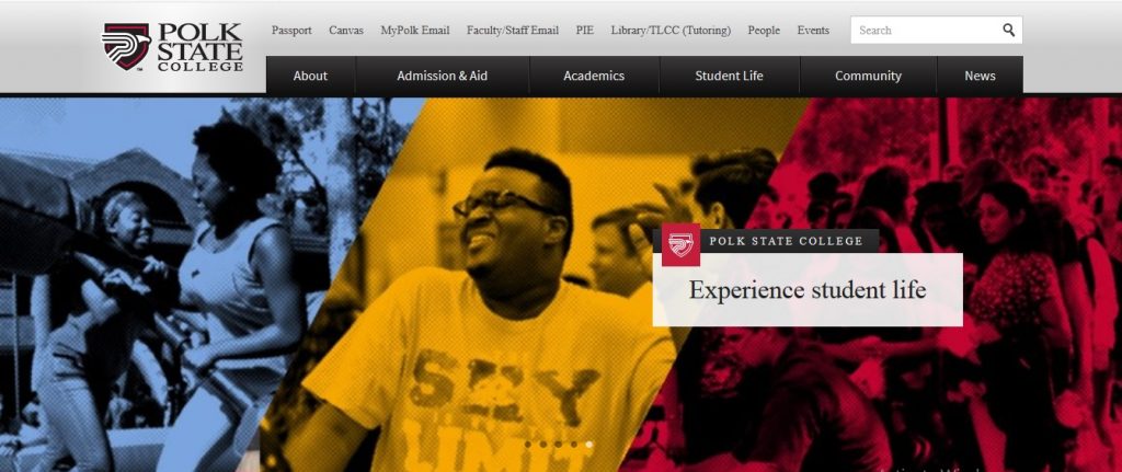
A part of Florida college system, Polk State College is home to thousands of students. This public state college is located in Winter Haven, Florida, USA and its website is designed with clean layouts keeping in mind the student’s needs. The forms especially stand out.
42. College Choice
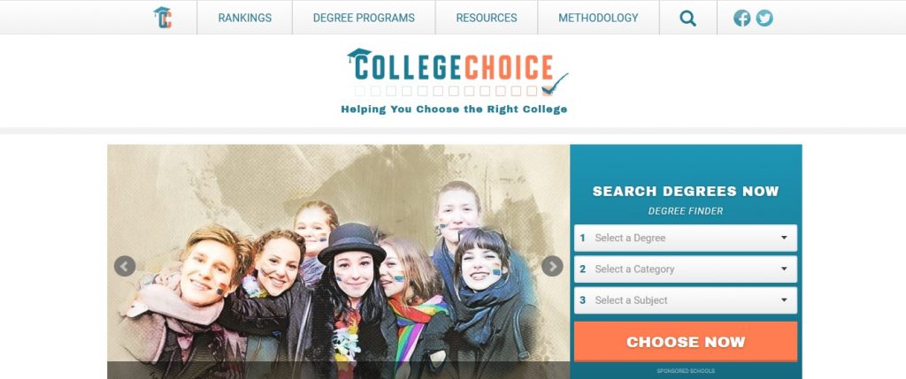
When you are taking the monumental decision of choosing a college, nothing can be left to chance. So, WP helps students navigate through various choices with suitable layouts by delivering all the vital information that they ever need.
43. International Gem Society
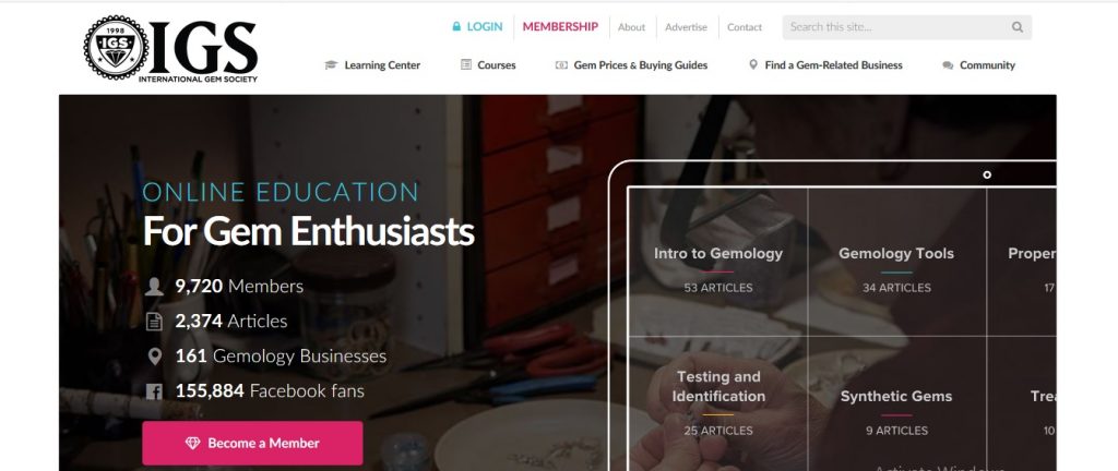
This high profile website caters to global gem related information, shopping and even authentication. The International Gem Society serves this crucial information and educational services through a well made website using a simplistic theme.
44. Nicholls State University
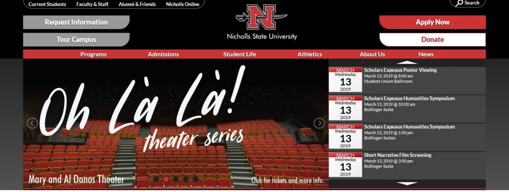
Based in Louisiana, Nicholls State University, is locally known for being a regional, comprehensive university delivering quality educational solutions. The website features large images, the headers are well placed and theme seems subtle to cater to both parents and students.
45. Skillcrush
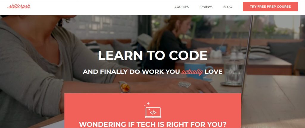
Skillcrush is the online portal that teaches web design, coding, and other highly marketable online skills. The videos are neatly organized in a boxed layout. The courses are subscribed with a secure payment system.
46. Boing Boing
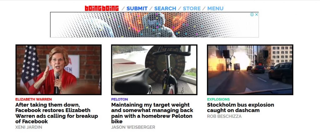
Boing Boing is as old as the WP itself. It too has evolved slowly and become the powerful blog that it is today. The articles, curated pics, podcasts and blogs are neatly organized using a boxed layout. The simple clean design delivers the message across to the visitors with easy to use navigation.
47. Canada

When a country runs its official website on WP, there are no questions about its credibility anymore.
48. 9To5Mac
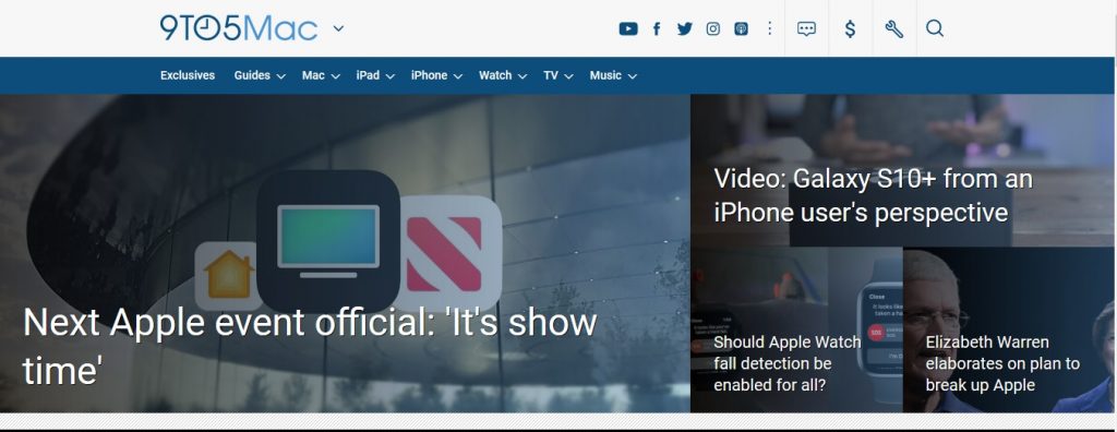
9To5Mac delivers live news, reviews and leaks about Apple products.
49. Longitudes

This blogs portal is like a media house is accessed by more than 10 million viewers. The layout is kept clean with a focus on content and news articles.
50. The Next Web
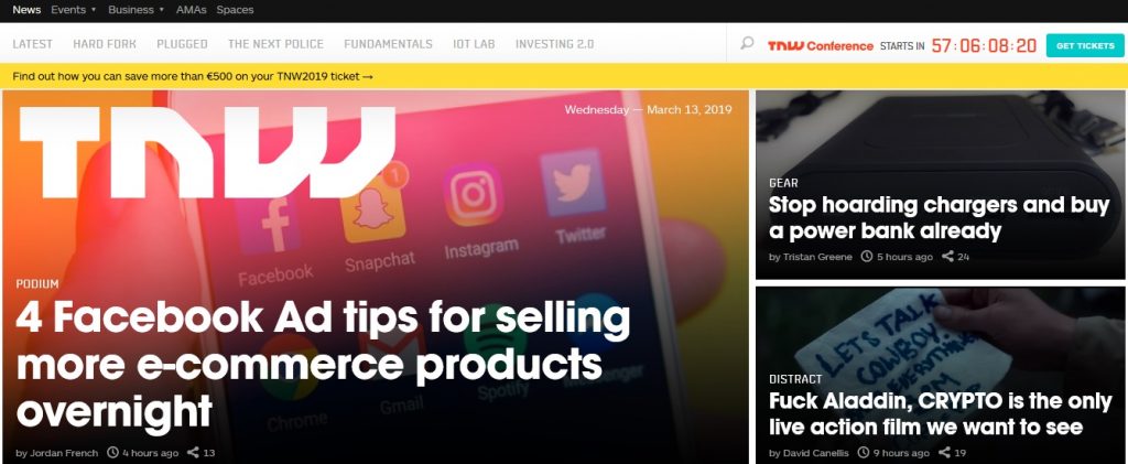
The Next Web, being an online publication, delivers fast news and even serves other platforms. Scalability, neat layout and a focus on content is thus well reflected in the design.
These 50 websites are just tip of the iceberg. There are thousands of other well known brands from various realm like fashion, technology, defense, news etc., that use WordPress for their online presence.
Do you know more websites powered by WordPress? Share them here.
I am so excited right now after reading this! Thank you!